A brand color is much more than a #01C0DE for a Design System
Corporate colors possess a richness that traditional brand guidelines often ignore. When addressing color in Design Systems, digital evolution and WCAG force us to update visual identity beyond a static hexadecimal code.
1. What “brand color” did the board actually buy?
When a board approves an “institutional color” in a brand guidelines presentation, they rarely approve a simple PNG with only this as its content:
Nowadays, it is customary to approve a mockup with different samples, convincingly simulating how the brand would work in the real world: with volume, lights, and shadows.
Like what is shown below (one of over 1,000 presentation templates offered by GoldenPixelStudio). In the IPAX simulator, the crosshairs indicate the actual value of each pixel. Moving them across the brand book, we can see that no two areas that appear to be the “same color” measure the exact same value.
If the approved brand book wasn’t a flat square, the approved brand was never an exact color.
And that is not “wrong.” It is the reality of a brand living in the real world. “Exact” values are a convention for print, not an expression of identity.
2. The natural variation of print
The historical purpose of color specifications is to define an ink specification to prevent two brochures from having different logo colors (e.g., one blue, another purple). But that specification does not mean the color will always look identical.
The following simulator, developed as part of the IPAX system, allows you to select the paper type and active lights to see their effect on the ink (a CMYK C20 M0 Y80 K10). For natural light, you can choose between sunrise, noon, overcast, etc.
That variation in perceived readings—not only in its code but also in the color name (according to the ISCC–NBS standard)—is completely normal and expected for any brand operating in the real world.
3. Test how color in your Design System works
The following simulator allows you to edit the “brand ink” (click on the first sample, or edit the #value), and see how it appears across different paper types and screens with varying qualities and brightness levels.
Artificial lights can be moved around, and they also affect screen rendering.
What does this mean for your brand?
The issue isn’t that color varies, but rather when brand guidelines and interfaces ignore that variation instead of governing it. A single code cannot handle the complexity of all use cases of color in design systems.
Just as brand colors adapt naturally in every scene, a Design System must resolve variations to ensure legibility and accessibility across different contexts (light mode, dark mode, continuous reading, high contrast).
To solve these challenges, at Kambrica we developed IPAX Foundation Layer: a system that allows Design Systems to evolve to meet modern demands, ensuring WCAG/APCA accessibility and scalability.

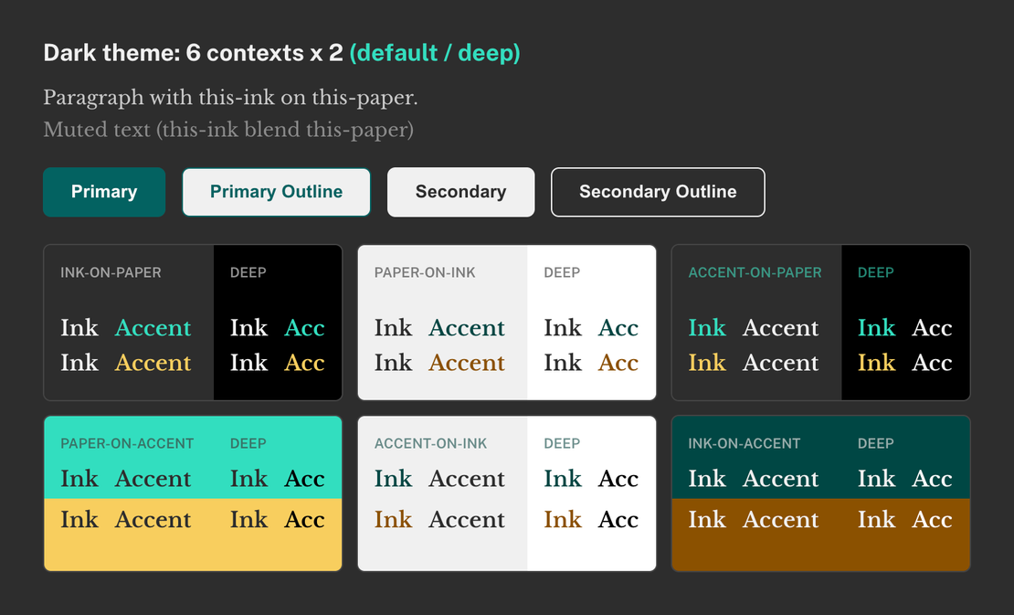
The IPAX system, which we presented at Rosenfeld Media, derives all Design System alternatives from a manageable set of concrete decisions, with an architecture of color and typography that is WCAG 2 / APCA accessible by construction.
If you want to learn how IPAX can help your Design System, let’s talk.